Color Theory for Men: What Colors Work Together
Color theory for men’s fashion comes down to three reliable pairing methods: matching colors by warmth (warm with warm, cool with cool), pairing a neutral with one dominant color, or using the color wheel to combine hues that sit opposite or adjacent to each other.
You don’t need to memorize a full color wheel to dress well — you need a small number of pairing rules and a sense of which undertone (warm or cool) your clothes and your own skin lean toward. Below is how those rules actually work in practice, not just in theory.
Key Takeaways
- Warm and cool undertones matter more than exact hue — navy (cool) and burgundy (cool-leaning) pair more naturally than navy and orange-toned rust (warm), even though both pairings look fine on a color wheel diagram.
- The 60-30-10 rule (borrowed from interior design, genuinely useful in menswear) keeps outfits from looking chaotic: 60% dominant neutral, 30% secondary color, 10% accent.
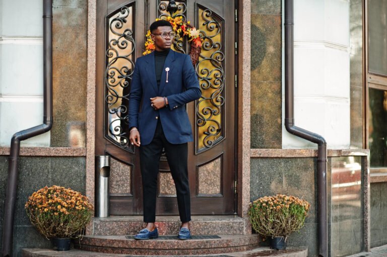
- Complementary pairs (opposite on the color wheel, like navy and burnt orange) create intentional contrast; analogous pairs (next to each other, like navy and teal) create a subtler, more monochromatic look.
- Your skin’s undertone (warm, cool, or neutral) determines which “pop” colors sit closest to your face — this matters most for shirts, ties, and sweaters, less for trousers and shoes.
- The single most common color mistake: pairing three or more competing “statement” colors in one outfit instead of anchoring around one dominant neutral.
Why Most Color Advice Fails in Practice
Most style content either oversimplifies color theory into “just wear neutrals” (true but unhelpful once you want to add any color at all) or drops an entire art-school color wheel on the reader without explaining how to actually apply it to a shirt-and-trouser combination. Neither approach gives you a repeatable method.
The gap is this: color wheel theory was built for paint and design, where hues are pure and evenly saturated. Clothing colors are almost never pure hues — a “red” tie is usually a muted brick or wine tone, and a “blue” shirt leans either toward icy cool or warm periwinkle depending on the dye.
Applying color wheel rules without accounting for these real-world variations is why some technically “complementary” outfits still look off. The undertone matters as much as the hue itself.
The Original Framework: Undertone Matching Before Hue Matching
Before reaching for a color wheel, check undertone first — it resolves more real-world clashes than hue relationships alone:
- Cool undertones: navy, charcoal, true black, burgundy/wine, forest green, icy blue, true white.
- Warm undertones: olive, rust, mustard, chocolate brown, cream/ivory, warm burnt orange, khaki.
- Neutral undertones (mix cleanly with either group): mid-grey, stone, tan, most denim washes.
The rule: stay within one undertone family for your main two colors, and use neutral-undertone pieces as the bridge between them if you want to combine a warm and a cool piece. This is why a navy blazer with olive chinos can look slightly off (cool jacket, warm trouser, no bridge) unless a neutral piece — a stone shirt, a tan belt — sits between them and softens the transition.
This single check prevents the majority of “I don’t know why this doesn’t look right” outfits, because undertone clashes are often subtle enough that people notice something’s wrong without being able to name it.
The 60-30-10 Rule for Outfit Color Ratios
Borrowed from interior design and genuinely transferable to menswear: split your outfit’s color distribution roughly into 60% dominant neutral, 30% secondary color, and 10% accent.
- 60% dominant: your jacket, trousers, or the largest visual block of the outfit — usually navy, charcoal, or another core neutral.
- 30% secondary: a contrasting but complementary piece — a stone chino against a navy jacket, or a grey sweater against navy trousers.
- 10% accent: the smallest piece carries the boldest color — a burgundy tie, a patterned pocket square, or one bold sweater in an otherwise neutral outfit.
The ratio matters because it tells your eye where to land first. An outfit that’s 33/33/33 across three bold colors gives the eye nowhere to rest, which reads as busy or uncoordinated even if each individual color is technically attractive. Concentrating the boldest color into the smallest area (the 10%) is what makes color “pop” without overwhelming the outfit.
How to Actually Use the Color Wheel (Without Overcomplicating It)
You need exactly two relationships from the full color wheel to cover almost every practical menswear decision:
Complementary Colors (Opposite on the Wheel)
Pairs like navy and burnt orange, or olive and burgundy, sit roughly opposite each other and create clear, intentional contrast. This works well for one dominant piece plus one accent — a navy sweater with a rust-orange scarf, for instance — but rarely works as two large, equal-sized blocks of color, which can read as costume-like rather than styled.
Analogous Colors (Next to Each Other on the Wheel)
Pairs like navy and teal, or olive and mustard, sit close together and create a subtler, tonal look rather than sharp contrast. This is the safer combination for larger pieces of an outfit — a navy jacket over a teal sweater reads cohesive in a way that navy and orange in the same proportion would not.
A genuinely useful shortcut: if you’re unsure whether two colors will clash, check whether they’re complementary or analogous, then apply the 60-30-10 rule based on which relationship you’re using. Complementary pairs work best at a 90-10 ratio (nearly all of one color, a small accent of the other); analogous pairs can be closer to 60-40 without looking busy, since they’re naturally more harmonious.
Building Outfits Around Your Skin’s Undertone
This is the piece most color guides skip because it requires more nuance than “wear what you like,” but it makes a measurable difference in pieces worn close to the face — shirts, sweaters, ties.
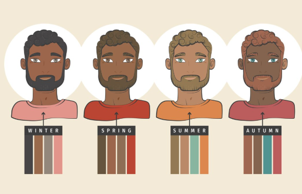
- Cool undertone (blue or pink hints in the wrist veins, silver jewelry tends to look better than gold): icy blues, true white, charcoal, and jewel tones like emerald or sapphire tend to look most flattering closest to the face.
- Warm undertone (green hints in the wrist veins, gold jewelry tends to look better than silver): cream and ivory instead of stark white, olive and rust tones, and warm browns tend to look most flattering closest to the face.
- Neutral undertone (a mix of both, or genuinely hard to tell): most colors work reasonably well, which means the undertone-matching rule for the outfit itself (not your skin) becomes the deciding factor instead.
This matters far less for trousers and shoes, which sit further from your face and have less visual impact on how “washed out” or “flattering” a color reads — undertone-to-skin matching is worth prioritizing for shirts, sweaters, and ties specifically.
Read also: Dressing for Your Body Type: A Men’s Guide
Comparison Table: Common Color Pairings and Why They Work (or Don’t)
| Pairing | Relationship | Works Because | Watch Out For |
|---|---|---|---|
| Navy + white | Neutral + neutral | Maximum contrast, zero undertone risk | Can look flat without texture variation |
| Navy + burgundy | Analogous (both cool) | Same undertone family, subtle richness | Avoid pairing with warm-toned shoes |
| Olive + navy | Cross-undertone | Needs a neutral bridge piece | Without a bridge, can look mismatched |
| Charcoal + burnt orange | Complementary | Strong intentional contrast | Keep orange to 10% (tie, pocket square) |
| Grey + mustard | Neutral + warm accent | Muted grey tones down mustard’s intensity | Bright/cool grey clashes more than warm grey |
| Stone + white | Neutral + neutral | Low-risk, works in any season | Can look bland without a third accent piece |
A Real Scenario: Diagnosing a Color Clash
A client came to me convinced his navy blazer and olive chinos “just didn’t work” even though both pieces were well-fitted and individually attractive. The issue wasn’t fit — it was undertone. Navy leans cool; olive leans warm. Without a bridging piece, the two colors sat next to each other with no transition, which is what reads as “slightly off” without being obviously wrong.
Swapping his white dress shirt for a stone-colored one (a neutral undertone) resolved it immediately, because the stone shirt sat between the cool jacket and warm trouser and gave the eye a transition point. The outfit’s individual pieces didn’t change in quality — only the undertone bridge did, and that was the entire fix.
Seasonal Color Considerations
Color choices also shift with season, not just personal preference — this isn’t about “seasonal color analysis” as a personal styling system, but about how fabric and lighting context change perception:
- Warm-weather months: lighter, higher-value colors (stone, light blue, white, soft olive) read appropriately for the season and also reflect heat better in genuinely hot climates.
- Cold-weather months: deeper, richer tones (charcoal, burgundy, forest green, chocolate brown) suit both the heavier fabrics typically worn and the lower natural light levels, which make pale colors look washed out by comparison.
- Year-round anchors: navy and mid-grey work in both contexts because they’re versatile enough in value and undertone to pair with either a warm or cool secondary color depending on the specific piece.
Common Color Mistakes to Avoid
- Combining three or more “statement” colors in one outfit — pick one dominant neutral and let a single secondary or accent color do the work; multiple bold colors competing for attention is the single most common reason an outfit feels chaotic rather than intentional.
- Ignoring undertone while matching hue — two blues can still clash if one leans warm (periwinkle) and one leans cool (icy blue); check undertone even when the color names match.
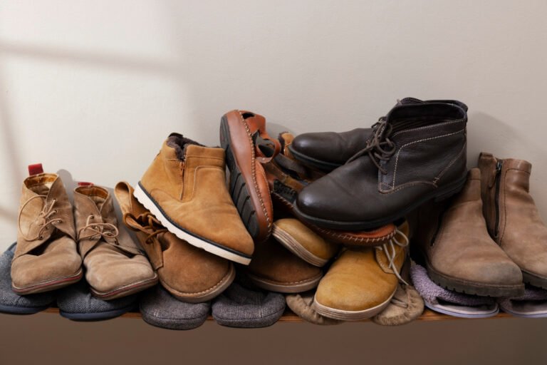
- Matching black and brown — this is one of the few genuinely reliable “don’t” rules in menswear, since black’s cool, stark undertone and brown’s warm undertone rarely sit well together, particularly in leather goods like belts and shoes worn at the same time.
- Over-relying on white as a “safe” neutral — stark white can look flat or even slightly harsh against warmer skin undertones; cream or ivory often performs the same neutralizing role with a more flattering result for warm-undertone men.
- Treating the color wheel as the only rule — a technically complementary pairing can still look wrong if the two pieces are unevenly saturated (a bright, saturated orange against a muted, dusty navy reads mismatched even though the hue relationship is textbook-correct); saturation and value need to roughly match, not just hue.
FAQ
What colors should every man have in his wardrobe? Navy and mid-grey are the two most versatile core colors, since both work across warm and cool undertones and pair reliably with nearly every secondary color; stone or khaki is the most useful warm-neutral bridge color to add next.
Can I mix warm and cool colors in one outfit? Yes, but it generally needs a neutral bridge piece (stone, grey, tan) between the warm and cool item to avoid the subtle clash that comes from placing two different undertones directly against each other.
What’s the easiest color rule for someone who doesn’t think about color much? The 60-30-10 ratio: pick one dominant neutral for 60% of the outfit, one secondary color for 30%, and reserve any bold color for the smallest 10% (a tie, pocket square, or single accent piece).
Do black and navy clash? They can, since they’re both extremely dark but not identical in undertone — most stylists suggest choosing one as the outfit’s dark anchor rather than combining both prominently in the same look, particularly in adjacent pieces like a black jacket with navy trousers.
How do I know if I have a warm or cool skin undertone? Check the veins on the inside of your wrist in natural light — if they look more blue or purple, you likely lean cool; if they look more green, you likely lean warm; if it’s a genuine toss-up, you likely lean neutral and have more flexibility with colors worn close to the face.
Is it ever okay to wear more than two main colors in an outfit? Yes, as long as one clearly dominates by the 60-30-10 ratio — the mistake isn’t the number of colors present, it’s giving two or more colors roughly equal visual weight, which removes the sense of intentional hierarchy that makes an outfit look coordinated.
Read also: